Experts
30 . 05 . 18

OVO Energy: Playing politics… and thrash metal

Words by: Print Power
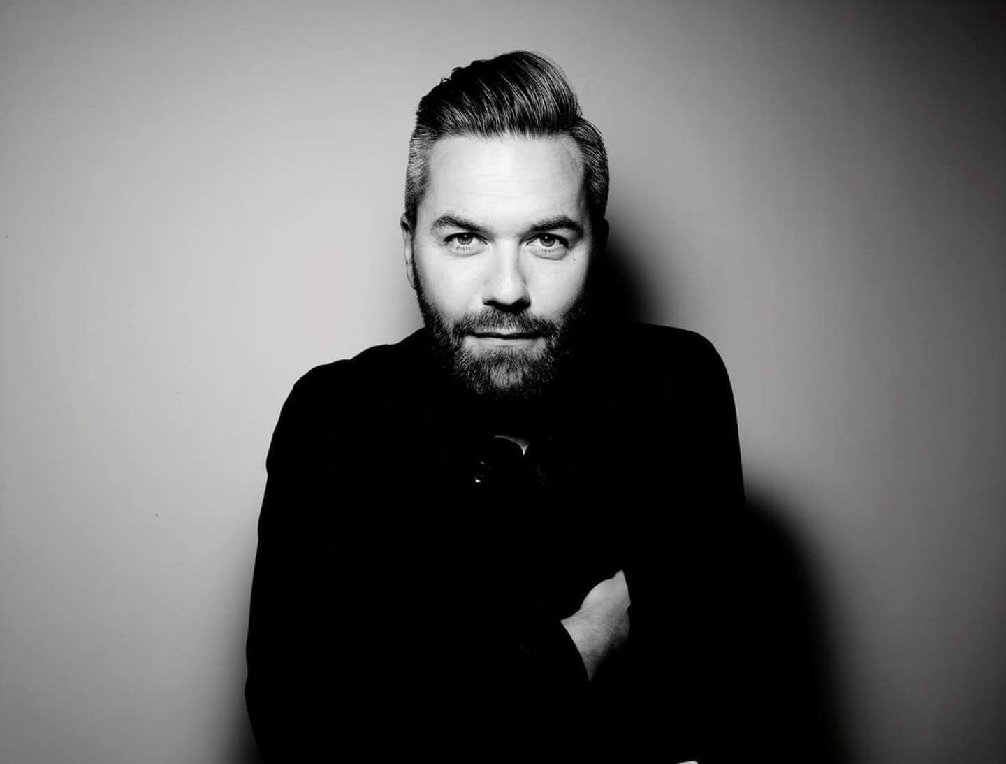
“In the real world, people fucking hate advertising” claims Uncommon’s creative chief, Nils Leonard. But he also believes a powerful image, in print or otherwise, has the ability to turn sceptics into brand ambassadors.
Screen Shot 2018-05-31 at 14.16.12.png

The power of print at a glance

  • Images have never travelled so fast – or been adopted by so many people. And that’s an exciting space for print to play in.
  • Using creative talent from outside the advertising world can help make a bigger impact in print.
  • A powerful image, alongside a rallying cry-style CTA, resonates – even with sceptical consumers.

OVO Energy, and its vision to create an unstoppable “energy system of the future – one that puts people and the planet first,” was the perfect fit for a values-led agency with a point to prove.

So, when Uncommon, whose philosophy is built on research showing most of us wouldn’t care a jot if 75 percent of brands simply vanished, was tapped to take the indie energy supplier mainstream – and differentiate it from the incumbents – the startup jumped at the chance.

The campaign’s message, masterminded by Nils Leonard and fellow Uncommon co-founders Lucy Jameson and Natalie Graeme, is ‘Power your life differently.

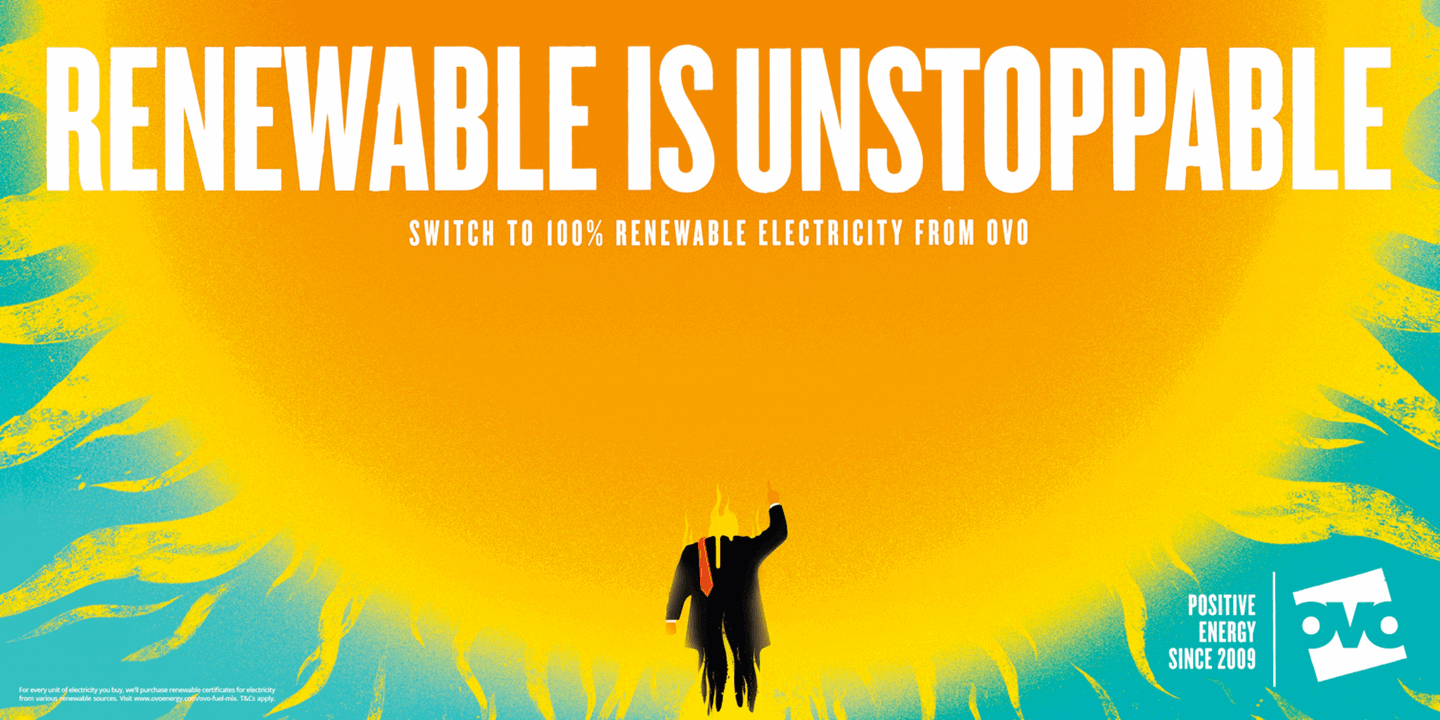
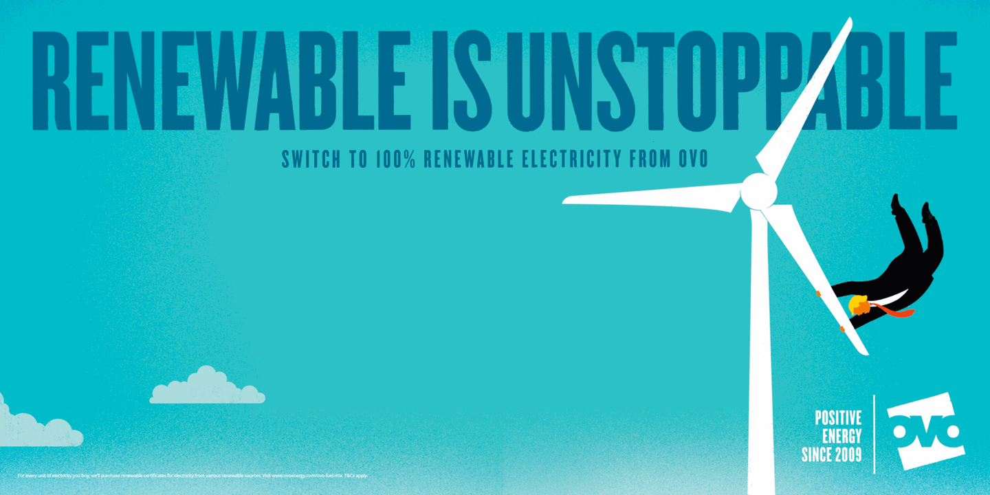
This fiery, Trump-bashing, metal-thrashing, integrated campaign spans film and print, and shows folks how to safeguard their environmental future with a simple switch to renewables.

image002.png

“First and foremost, we didn’t want anyone to assume these ads were from an energy supplier,” says Leonard. Which meant ditching the dullard of a template that so much of the industry subscribes to – from the lens flares and family portraits to the meal-time chatter.

“The category is full of tired old visual tropes,” he argues. “We wanted to find a very different way to tell a story.”

Besides, he says, “In the real world, people fucking hate advertising – and, by proxy, our industry. We’d like to change that.”

It helped that OVO was a tough client to please – and open to pushing boundaries. “We showed them a lot of work in the early stages,” recalls Leonard. “And they encouraged us to really amp it up and take the gloves off, which was music to our ears.”

With illustrator Edel Rodriguez – an artist whose searing depictions of President Trump have already appeared in publications such as Time and Der Spiegel –  at the helm, Uncommon injected some snarky, pointed socio-political commentary into its creative.

Why Rodriguez? “I wonder whether we in advertising use enough people who create imagery outside of advertising,” Leonard muses. “If our game is getting into newspapers and blogs, shouldn’t we be working with artists that court that world more?”

Choice of illustrator aside, the use of a character who, in Leonard’s words, “may or may not be Donald Trump” (the president, of course, famously declared global warming “a hoax”) lent the work an even greater populist cachet, and became a sort of rallying cry behind which consumers could unite. “We wanted people to act. The idea that, if you’re against him then you’re with us, is very much what we’re about.”

The category is full of tired old visual tropes. We wanted to find a very different way to tell a story
Nils Leonard
Founder, Uncommon

Says Leonard: “The choices we make every day, not just about energy, but in every sense, have an impact on the planet. So, we wanted to create images that make a political statement and send a strong environmental message. That was really the inspiration behind the print work – and the campaign as a whole.”

Print media was always going to be a part of the mix, he adds – not least because “the image has never been more powerful”.

His other reason for using it, though, is refreshingly democratic: “Everything we do here must live in print, but in other contexts too. If you’re thinking about the role of print these days, it should be to accompany a message you want to talk about in every channel.”

Designers and art directors, Leonard suggests, have forgotten the valuable role print – and powerful print images – can play in amplifying the effectiveness of media-neutral briefs or brand awareness. 

“We’ve seen a lot of people photographing the ads and passing them on. That’s part of the job nowadays. If you’re making imagery, even in print, it should be shareable.”

image003.png

He refers to the Paper magazine cover that effectively broke the internet. “The most-viewed shot of 2014 was of Kim Kardashian with a Champagne glass on her arse. That’s easy to dismiss, but the art remains. If you get the image right, you can tell a story not just of a moment, but of a year. An image of a period in time.”

The cover itself, which evoked some of the spirit of the beloved Esquire covers from the 60s and 70s (“You know, Muhammad Ali with the arrows [in April 1968]”), might have got a bit lost amid all the subsequent social chatter, but it was convincing proof that a powerful picture in print could get people talking, Leonard explains.

“My god, we are built for that kind of image nowadays, right? Never have images travelled so fast. Never have they been adopted by so many people. We’re witnessing the rebirth of the image. And if that’s the game we’re in, it’s a really liberating place to play for print – provided you play it the right way.”

OVO, it seems, has played it just right. According to Uncommon, in the months immediately after the ads were aired, the brand saw its advertising recognition climb from five percent to 19 percent – meaning one in five people in the UK claim to have seen the campaign.

Even for a print-backed drive, that’s what you might call Uncommonly good.

Want to know more about print as part of the media mix? Sign up to our newsletter.