Prev Article
Lessons from the content marketing master
Next Article
How Stabilo used print ads to ‘highlight the remarkable’
case studies
15 . 03 . 19

VW’s clever use of print has a happy ending

Words by: Print Power
How Swedish agency NORD DDB breathed new life into a familiar format with a twist on an old bedtime story
Picture VW.jpg

The power of print at a glance

  • The juxtaposition of traditional communications with cutting-edge technology creates a compelling method of telling a story
  • In evoking tactile childhood nostalgia in an adult market, an emotional impression is founded
  • New light-sensitive inks offer fresh creative possibilities, and enhance the element of surprise

The figures tell a terrifying tale: that unlit rural roads are dangerous places for Swedish wildlife. In 2017 alone, there were more than 60,000 accidents involving animals – with more than a few human casualties, too.

So, when NORD DDB was tasked with promoting the new Night Vision feature for the VW Touareg – a thermal imaging camera designed to detect persons and animals on the road – it decided to shine a light on fauna’s plight, using a highly unusual approach.

“Car advertising can be pretty calculated and on-the-nose,” says Anton Bolin, the project’s art director. “We wanted to give Swedes a warmer, more human message – particularly over the festive season. And the idea of contrasting talk of cutting-edge tech with an old-school Swedish bedtime story felt refreshingly original.”

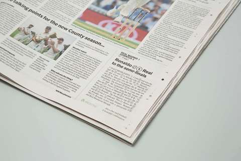
The resulting bittersweet children’s tale was published on the back page of the financial paper Dagens Industri Weekend. The ad is all text, save for a small illustration, and tells the story of a lonely deer who wanders perilously close to the road.

It’s hardly Hans Christian Andersen, but there is one fantastical flourish worth noting. Read the story in daylight and our doe-eyed protagonist meets an unfortunate, all-too-familiar end. Read it under cover of darkness, though, and you’re treated to a happier outcome – in glow-in-the-dark text.

For VW’s execution to shine through, both in the dark and in a crowded media landscape, the ad was printed using two layers of ink: a traditional one for daylight, and a fluorescent one for night.

The team tested a variety of fluoro options to find one best suited to text, and discovered it in a printing house in Estonia. “The problem we encountered,” recalls Bolin, “was that the ink was very thick, meaning we had to adjust our choice of typeface.”

A quick aside for typeface nerds: DDB originally planned to publish the story in Garamond, but the heavy-set nature of the ink meant the terminals on some letters were small-to-nonexistent. A solution came in the shape of Georgia, a font originally intended for screens. To increase legibility, the team drew ink-traps on certain letters.

So why choose a traditional format to promote an ultra-modern feature of the VW marque?

NORD DDB copywriter Svante Pårup says the decision to use a children’s tale felt emotive and appropriate for the season. And what better way to deliver the message than in a format typically associated with storytelling? A magazine, he suggests, is about as close to a book as you can get – without being one.

“We imagined people reading it, cosy in their Chesterfield armchairs,” he says. “It also felt more interesting to advertise modern car technology in a medium people often see as old-school – and to do it in an innovative way.”

L.L.Bean, the American outdoor apparel retailer, is another brand that has recently used special inks as the basis for a bright idea. In a bid to get folks off the couch and out into nature, it took out a full-page ad in The New York Times featuring the company’s new tagline (‘Be an outsider’) and a simple call to action: ‘Just bring this outside. No, seriously. Take this outside.’ Readers who did just that saw an entire brand manifesto magically spring to life on the page, as the ad’s photochromic inks were exposed to the sun’s UV rays.