Experts
06 . 05 . 19

Recasting print – a design perspective

Words by: Print Power
The role of print in the media mix has changed. But marketers mustn’t underestimate the power of physical media to elicit an emotional response and challenge the status quo
Lucienne Roberts 2.jpg

The power of print at a glance:

  • Print’s diminished status as a mass communication medium shouldn’t colour perceptions about its ability to leave an emotional imprint
  • Print work with high production values and an emphasis on great art direction is winning out in a crowded and chaotic media landscape

Lucienne Roberts, director of graphic design studio LucienneRoberts+ and co-founder of publishing venture and graphic design advocacy initiative, GraphicDesign&, sees herself as part of a rich print tradition. One she and her design compatriots clearly appreciate, but one undergoing extraordinary changes in a crowded media landscape. 

Roberts’ background is in Graphic Design, English Literature and Drama, all areas that inform the editorial and exhibition design focus of her studio LucienneRoberts+ and publishing and curatorial approach of GraphicDesign&. They’re also categories that require she wield the power of print media to cut through the noise.

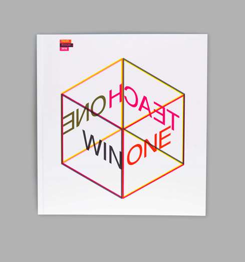
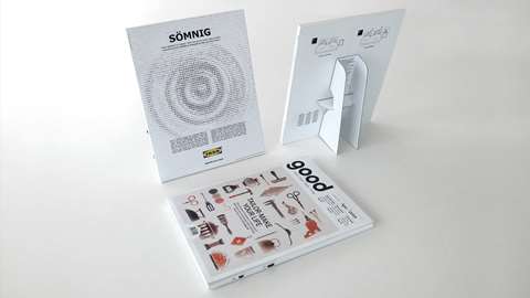
The award-winning GraphicDesign& paperback, Page 1: Great Expectations, falls into the editorial category. In it, Roberts and her colleagues asked 70 designers to layout page one of the classic Dickens novel in what is “an unusual typographic experiment, exploring the relationship between graphic design, typography and the reading of a page.”

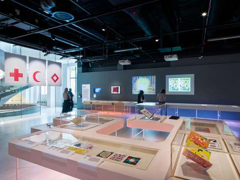
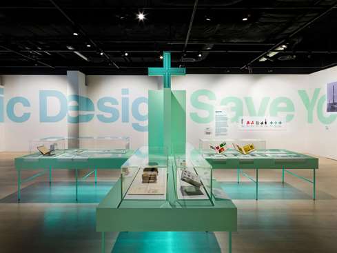
Can Graphic Design save Your Life?, meanwhile, is one of two major exhibitions GraphicDesign& co-curated, alongside the Wellcome Collection, to look at the relationship between graphic design and health.

CanGraphicDesignSaveYourLife? 1.jpg
CanGraphicDesignSaveYourLife? 2.jpg
medication section.jpg

Addressing very different questions, each project is nevertheless an affirmation of the power of physical media. “Museum-goers will walk through a space, readers will turn the page… Either way, you’re inviting them to engage,” says Roberts. “To make that journey interesting, intriguing, even playful.”

Be it a book about nuns and their fashion choices or an exhibition about graphics and politics, print’s power to elicit an emotional response is at the heart of Roberts’ design and curatorial philosophy.

Print: a more precious thing

It’s something we see mirrored time and again in adland; be it a Ford mailer that stirs emotions in owners with a tactile, humorous break-up manual, or an Ikea print ad that appeals to many senses to create a clear point of difference.

Roberts sees this as a repositioning of print – away from mass appeal to more niche, intimate, exclusive offerings. As an affirmation of its ability to deliver this sort of emotional punch.

Looking Good spread 9.jpg

“Print has become a more precious thing,” she argues. “And when you consider newspapers, books and magazines, the ones that are most successful are those that devote serious time and thought to what print does well.”

Like costly signalling.

In the crowded food market, titles with high production values and an emphasis on cool art direction, like The Gourmand and Gather Journal, have captured hearts and minds.

More exclusive, more targeted (and sure, more expensive), these mags fit into a growing trend of publishers who are, according to the FIPP Innovation in Magazine Media report, “obsessed with delivering exclusive content and a premium experience to smaller, select, lucrative… audiences”.

Mushpit and Gal-dem are great examples of titles with tightly defined identities and readerships.

Raising vital questions about gender, diversity and inclusion, and advancing those debates, they are the antithesis of the typically populist appeal of mainstream women’s mags – which appear to be edging towards irrelevance.

It’s a metamorphosis that finds some echoes in the current vinyl revival.

While music has become both easier and less expensive to distribute and access, the convenience has left many fans pining for the golden days of ‘authentic-sounding’ LP records – when new releases were an event, not a Spotify notification; and album covers were works of art, not just a tile on a screen.

Show don’t tell: the importance of experimentation

“Recently, we’ve seen more and more designers experimenting with print in these ways,” says Roberts – “paying more attention to the things print can do that digital can’t. Colour is one example; but also beautiful inks, finishes and folding. Not forgetting that the paper itself is a form of art.”

nice typefaces 2.jpg

When Volkswagen looked to warn Swedish drivers about the dangers of unlit roads for native wildlife, they did so with a beautifully illustrated press ad/children’s tale about a deer who wanders perilously close to the road. The fantastical tale, when read in daylight, had our doe-eyed protagonist meeting an unfortunate end, while in darkness glow-in-the-dark ink reveals a happier ending. It’s a message that feels all the more meaningful thanks to the very personal nature of the medium and a clever twist on a traditional execution.

Likewise, Japanese health company ANGFA created a Washable Book to teach children in Cambodia the importance of having clean hands. Scrubbing the hands of the book’s characters using the soap provided revealed a series of colourful illustrations that helped to bring the tale (and the issue) to life. Primitive though it may seem, touch isn’t only the first sense to develop, it’s also arguably the one that engages us the most on an emotional level.

Similar to the above brands and agencies, Roberts is determined to recast perceptions around the role and value of print media as a channel that drives a meaningful response.

Ebiquity and Radiocentre’s oft-cited paper, Re-evaluating Media, shows there is a worrying gap between what marketers think drives an emotional response, versus what actually does. For context here, marketers put magazines in fifth spot, when in fact they are the second-most powerful channel.

One way Roberts is trying to combat this discrepancy is simply by producing more inspirational and affecting print work.

A brochure project she and her studio ‘conducted’ for the Orchestra of the Age of Enlightenment in London emphasised form and function, even swapping in fluorescents in place of a standard colour pallet.    

oae-brochure-roger.jpg

The 2016 D&AD Annual – a tome that was briefed in as both a stunning collection of some of the world’s best brand creative and a manual (“Almost a teaching aid of sorts,” recalls Roberts) – also plays with print conventions, by swapping the CMYK plates to distort the judging panel (below).

D&ADcover.jpg
162-163.jpg
040-041.jpg

Realigning marketers’ perceptions – and rediscovering the craft – of print

It’s fair to say, then, that Roberts is an avowed print advocate, with a positive outlook on its future – something she shares with many in her line of work and beyond.

In a title published in 2015 – Graphic Designers Surveyed – GraphicDesign& spoke to 1,988 designers on both sides of the Atlantic, teasing out their fanatical, funny and frank takes on their profession.

Questions asked included: ‘Have you ever been asked to “make it bigger”?’ [Most have]; ‘Which of the following describes your design specialism?’ [Mostly graphic design]; and ‘What is the worst/best thing about being a designer?’ [Too many to list].

Interestingly, they were also quizzed on whether print would be dead within 10 years. The consensus was overwhelmingly ‘No’. Roberts herself believes assertions that ‘print is dead’ are greatly exaggerated.

But, she concedes: “Great print design isn’t as appreciated as it should be – and I wonder whether there’s enough education around what it takes to succeed. And that you need to have certain ‘persuasive skills’. ”

It’s a truth lamented by media commentators too. In a 2018 column, Campaign’s global editor in chief, Claire Beale, mused that the craft of creating great print ads has been lost – and needs to be rediscovered.

The answer, though, isn’t to hark back to print’s golden years, when it was the mass medium of choice – but to embrace a new role for it – one that is premium, niche, experimental… and, of course, precious.