
This is Part 1 of a two-part series celebrating a total of 11 award-winning campaigns in the Print & Publishing category, that show how print continues to lead in brand storytelling, consumer engagement, and campaign effectiveness. If you're in marketing, advertising, media, or publishing, these cases are a vibrant reminder of what print can achieve.
Six global brands that prove the power of print in Cannes
For the sixth year in a row, here’s a selection of the most inspiring print campaigns from the Cannes Lions International Festival of Creativity—a selection of winning campaigns from global brands that continue to include print advertising in their media mix.
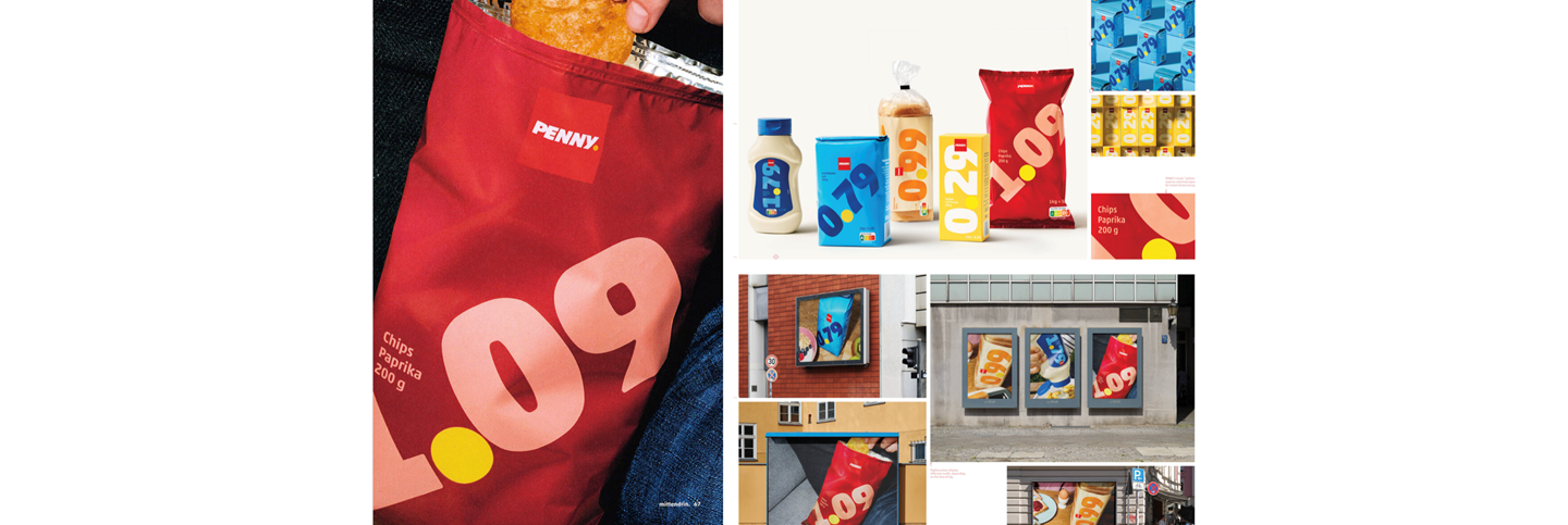
PENNY - "Price Packs"
Award: Grand Prix Print & Publishing
Agency: Serviceplan Neo Munich
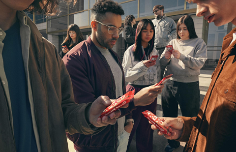
As inflation took its toll on German households, PENNY, the discount supermarket chain, responded not with discounts, but with design. The “Price Packs” campaign transformed five staples—oatmeal, toast, salt, chips, and mayonnaise—into price-tagged statements against economic uncertainty.
Faced with consumer mistrust over opaque pricing and indistinct private labels, PENNY turned packaging into the message. Each product featured a fixed price, printed in bold, colourful type directly on the front. In effect, the packaging became the print ad—a standout example of how print advertising can deliver clarity and impact at point of sale.
Launched as a four-week trial in September 2024, the campaign struck a chord—1.4 million units sold in just a month. What began as a limited-edition test soon became a permanent part of PENNY’s product line, signalling a long-term commitment to price transparency and reinforcing trust through effective printed communication.
The campaign impressed Cannes jurors for its multi-dimensional use of print. It merged packaging, POS promotion, and media messaging—hitting all five Ps of marketing in one bold, physical execution.
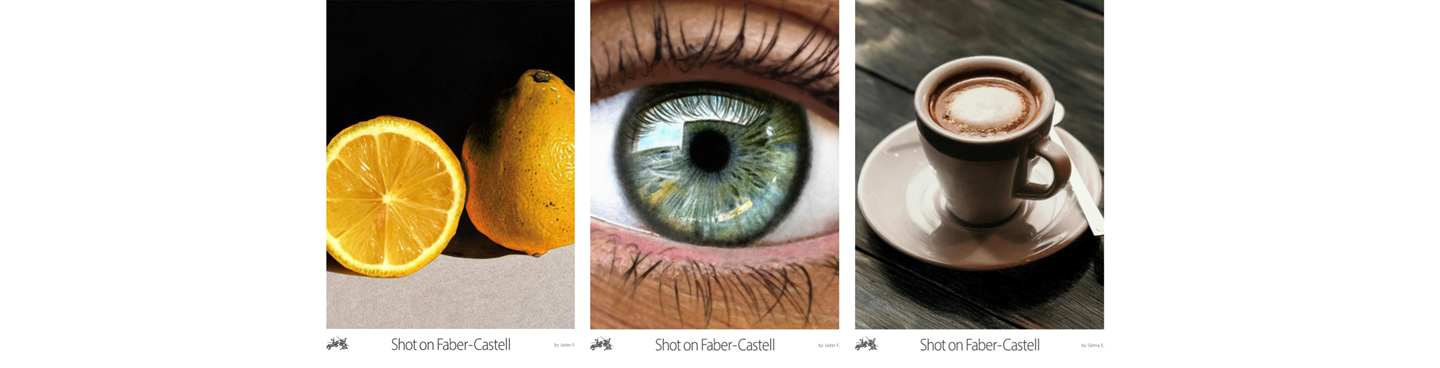
Faber-Castell – “Shot on Faber-Castell”
Award: Bronze Lion
Agency: David São Paulo
In an advertising landscape dominated by high-resolution digital photography, Faber-Castell turned to pencils to deliver an unexpected twist. The “Shot on Faber-Castell” campaign mimics photographic close-ups—lemon skin, coffee foam, human eyes—all meticulously drawn using only Faber-Castell coloured pencils.
Borrowing its name and aesthetic from Apple’s famous “Shot on iPhone” series, the campaign subverts tech expectations by proving that analogue tools can achieve stunning hyperrealism. Executed in Brazil, the illustrations became optical illusions—artwork so precise, they fooled the eye.
Each poster positioned Faber-Castell pencils not just as nostalgic stationery, but as powerful tools for professional-grade precision and artistic expression. This campaign celebrated traditional craftsmanship in a world leaning heavily digital.
Judges praised its concept, execution, and visual wit. “Shot on Faber-Castell” stands out as an elegant blend of analogue mastery and modern storytelling—reaffirming print’s unique value in the broader media mix.
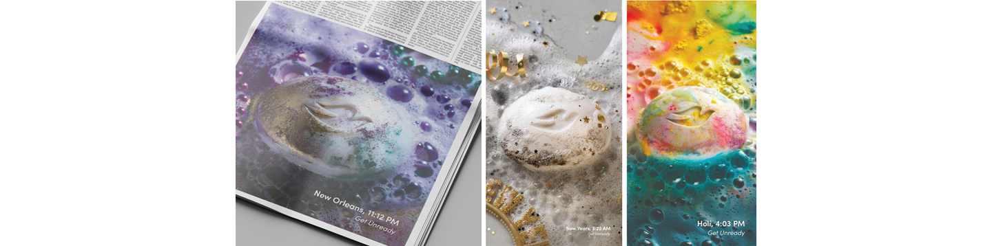
Dove – “Unready for Anything”
Award: Gold Lion
Agency: Ogilvy New York / London
Dove has long made a virtue of honesty in its branding, and its latest global print campaign continues in that vein. “Unready for Anything” captures the colourful aftermath of celebration—Mardi Gras beads, Holi powder, Carnaval feathers—all gently resting around the Dove Beauty Bar.
Rather than portraying polished perfection, the visuals celebrate the messy exuberance of real life. Dove isn’t prepping you for the next big thing; it’s helping you come back to yourself. Each print ad is a freeze-frame of joy’s residue, with the Dove bar symbolising quiet care and emotional reset.
This campaign is a prime example of sensory print storytelling—invoking memory, texture, and even scent. In a crowded wellness market, it positions Dove as a brand rooted in human transition and recovery, not manufactured ideals.
Awarded a Gold Lion, the campaign earned praise for its cultural relevance, emotional depth, and tactile beauty. As one of the most consistently awarded brands at the Cannes Lions International Festival of Creativity, Dove continues its legacy of socially responsible, emotionally authentic work that challenges conventions and celebrates real beauty. For brand marketers, it’s a reminder that print remains a powerful canvas for narrative depth and visual emotion.

Stella Artois – “Hiders Keepers”
Award: Silver Lion
Agency: Ogilvy New York
Stella Artois’ Silver Lion-winning campaign, “Hiders Keepers”, turns print advertising into a visual game. Created by Ogilvy New York, the campaign presents cluttered refrigerators full of party leftovers—each concealing a Stella Artois, waiting to be found.
Drawing on the “I Spy” genre, these ads highlight a relatable behaviour: people hide their favourite beer so no one else gets to it. The visual puzzle is immediately engaging, while the tagline —“Hiders Keepers”—delivers a clever, memorable twist.
Published in Argentina, the UK and the US, the campaign capitalised on premium print placements in newspapers and magazines to invite reader interaction. Photographer Ale Burset crafted detailed, immersive scenes, encouraging viewers to search, smile, and connect with the brand.
For sales professionals and media planners, the campaign is a case study in how print can drive playful engagement and brand elevation simultaneously. It’s not just beer marketing—it’s print media at its witty, participatory best.

Oreo – “A Decision Was Made Here”
Award: Silver Lion
Agency: LePub Bogotá
Sometimes the best choice is the simplest. Oreo’s “A Decision Was Made Here”, developed by LePub Bogotá, uses minimalism to maximum effect. Each print ad features a lone object—a banana, a duck, a bunch of roses—accompanied by the cryptic phrase: “A decision was made here.”
What’s missing is the Oreo itself, left to the viewer’s imagination. This understated approach challenges conventional product placement, relying on inference and wit to convey desire.
The ads use clever copy to create a quiet, confident narrative. It’s not an ad that sells—it invites. The idea is flexible, scalable, and undeniably memorable.
Judges highlighted its clever restraint and conceptual strength. For creative agencies and brand strategists, it’s a masterclass in how print advertising can invite curiosity, fuel discussion, and leave a lasting impression—without saying too much.

Colgate – “Not Every Smile Starts as a Smile”
Award: Silver Lion
Agency: VML Madrid
Colgate’s Silver Lion-winning campaign, “Not Every Smile Starts as a Smile”, captures the chaos of parenthood with brutal honesty. Created by VML Madrid, the campaign centres on kids in full-blown tantrum mode—mid-scream, toothbrush in hand.
Gone are the spotless bathrooms and angelic smiles. In their place: pyjamas stained with toothpaste, tears, and red faces. The message? These are the real moments of parenting, and Colgate is there for all of them.
Launched across print, outdoor and video in April 2025, the campaign aligns Colgate with authenticity over aspiration. It’s brand storytelling rooted in truth—and it connects.
Complemented by a donation of 23 million toothbrushes and toothpaste products, the campaign reinforces Colgate’s social impact and marketing ethics. It’s a powerful reminder that great print advertising doesn’t just sell—it supports, reassures, and reflects real life.