
In a crowded marketing landscape where brands are vying for attention on multiple channels, recent research proves that attention is one of the most valuable commodities when it comes to brand recall and ROI. Attention can be summed up as the act or state of selectively concentrating on something while ignoring other things. And with digital noise and screen fatigue on the rise, particularly after the pandemic, it’s heartening to know that print eclipses digital when it comes to harnessing quality attention and driving sales.
Attention technology company Lumen’s research in partnership with Japanese media agency Dentsu and Ebiquity, proved just how short attention spans in any form are. For example, a 20 second ad might only get noticed for 1- to 3-seconds. But it’s when they looked at the difference between digital and print media that the results got interesting. Yes, we’ve all been looking at our screens more, but their research proved that while a typical YouTube 6-second ad might get around 2.4-seconds of attention, a typical full-page ad in a newspaper might get around 3.3-seconds of attention. When people read print media, the quality of attention we give to the ads is greater (read more about it here) than it is to the blink-and-you’ll miss it digital ads.
Quality beats quantity
Recent WARC research further emphasises that exposure time to ads and visual impact matters. And the environment can influence both. In their Best Practice report from January 2022, they discovered that ads in ‘quality’ contexts gain more attention. Magazines are a trusted, quality context that carry well-placed, targeted ads. And more people say they pay attention to advertising in magazines than any other environment in print or online. Plus, according to Newsworks, the latest IPA Touchpoints data (2021) reveals that an incredible 23 million Brits read national news brands every month – just over half the population. Out of those, readers spend 1 hour 17 minutes with their daily newspaper on the days they read, and 1 hour 26 minutes with their Sunday papers. That’s a heap of exposure time to well-placed adverts.
So how can advertisers fix what WARC calls the ‘distraction economy’ – the act of mining ever-lower quality human attention from distracted consumers and squandering what little attention that can be garnered by poor creativity? To reverse this, they recommend moving to ‘responsibly sourced attention’ – that means in a trusted environment, with quality targeting and less clutter. Everything that print advertising offers in fact.
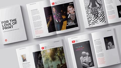
And of course, versatile print champions creativity, and creativity will always get noticed. So in honour print advertising’s many attention-grabbing advantages, Print Power is delighted to bring you some of its all-time favourite, gloriously creative print campaigns that make you look…
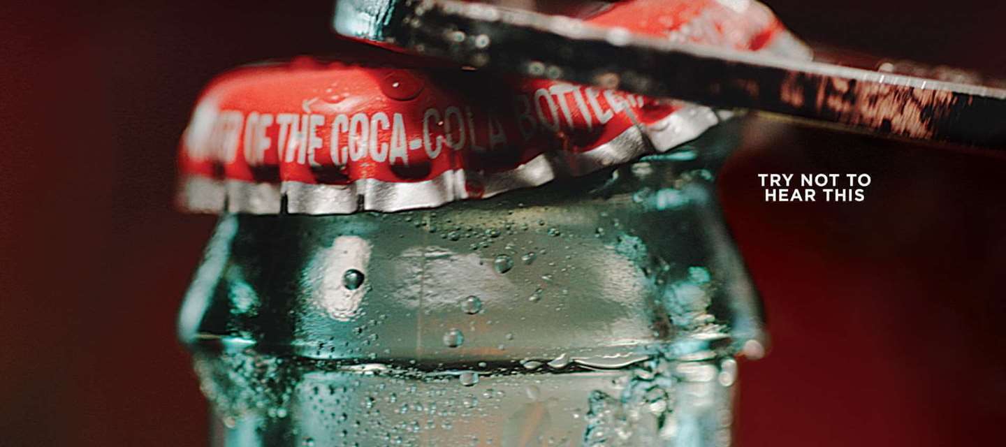
Coca-Cola: See it, hear it, want it
Simple, striking and effective, Coca-Cola and DAVID The Agency’s Cannes Lions-winning campaign brought the sensations of sound to print. Tempting you with a beautifully shot close-up of a Coke being opened or poured next to the words ‘try not to hear this’, you actually can’t help but hear it and subsequently crave it. Demonstrating the power of a single photograph to tap into your thirst, it also creates a synaesthesia-like effect that triggers you hearing the delicious ‘kttccchhhh’ as the can or bottle is cracked open. Read the full story of this seductive attention grabber here.