Prev Article
Print’s sensory power resurfaces at Cannes Lions
Insight
15 . 12 . 25

Books as brand media: how marketers are using books as advertising

Words by: Ulbe Jelluma
From Evvy’s gender health gap manifesto to Bottega Veneta’s poetry project and Adidas’s football manual, brands are rediscovering the printed book as a strategic tool in modern print advertising – using high-spec production, deep reading and shelf-life to achieve what fast digital media can’t.
hennessy_LeBron-James_book_Cannes-Lions_book.jpeg

Across fashion, finance, sport and social causes, brands are turning to books as a central creative vehicle – not as an afterthought or corporate anniversary trinket, but as a medium that carries meaning, status and memory in ways that digital advertising struggles to match. Books concentrate everything print is good at: deep attention, long-term presence, sensory richness and cultural legitimacy.

From ‘effed facts’ to a one-page joke

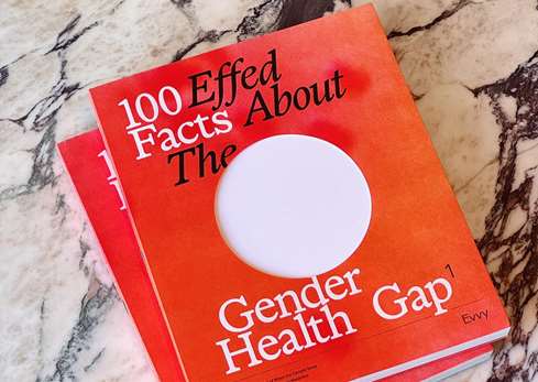
At the serious end sits 100 Effed Facts About the Gender Health Gap, created by vaginal microbiome company Evvy for Equal Research Day. It is a limited-edition coffee-table book bringing together 100 stark statistics on the systemic under‑researching and under‑diagnosing of women.

The production is deliberately emphatic: a bright red printed softcover with a cut and foil‑stamped jacket, roughly 8.5 x 10.5 inches and more than 250 pages. Inside, a large circular die‑cut hole runs through every page. It cuts across images, text and diagrams – a permanent absence that becomes a tactile metaphor for the gaps in women’s health.

Gender_health_Gap_Evvy_Cannes-Lions_books.jpg

The focus on content and form has paid off. The book sold out in less than 48 hours, and the die‑cut hole became the visual shorthand for the campaign across social feeds, editorial coverage and events – proof of how a print object can lead a wider conversation and mobilise support for research.

Hennessy’s collaboration with LeBron James heads in the opposite direction. The brand produced a slim hardback with all the trappings of a serious biography – linen‑like cover, foil title, creamy stock – then filled it with just one written page. The excess white space underlines the joke, playing on the meme that James is always photographed on page one. The book becomes a talking point and a launch device for a limited‑edition cognac.

Two very different tones; one shared insight. When a brand makes a book – whether dense or minimal – people tend to take notice.

Birkenstock_open.jpeg

Writing yourself into history: Birkenstock’s monumental volume

Birkenstock’s anniversary tome resembles a museum catalogue more than a piece of marketing. Hundreds of pages are printed on heavyweight coated stock for photography and slightly textured paper for essays, with an Otabind‑style lay‑flat binding and a predominantly white cover with discreet debossed titles.

Across its pages, 250 years of production, design evolution and cultural appearances are documented. The argument is quiet but firm: Birkenstock is not a fashion moment but an industrial heritage brand.

Editorial gravity: Invesco QQQ’s cookbook

Where Birkenstock leans into history, Invesco QQQ leans into editorial culture.

The QQQ ETF has been around for 25 years, tracking companies on the Nasdaq‑100. The Recipe for Innovation cookbook asks what might happen if that financial product behaved like an independent culinary magazine. The result is a 128‑page cookbook/zine with a soft‑touch French‑fold cover, linen‑textured spine and uncoated stock chosen to flatter both food photography and data graphics.

Inside, chef interviews sit beside full‑bleed images and recipes inspired by the companies within the ETF. Built to function in real kitchens – with lay‑flat binding, tinted section dividers and a controlled colour palette – the book gives a digital financial product a tangible, domestic presence.

Invesco uses print here as a trust‑building device, reframing the vocabulary of finance in cultural rather than corporate terms.

Bottega-Veneta_Book_Cannes-Lions.png

Poetry as brand language: Bottega Veneta and Yu Xiuhua

In Shanghai, Bottega Veneta built a three‑dimensional logo out of 19,000 green‑covered poetry books by Yu Xiuhua. Each book is a carefully designed item: Bottega‑green palette, blind‑embossed jacket, smooth low‑gloss paper for verse, and a fold‑out poster and bookmark tucked into a French‑fold back cover.

Known for its slogan ‘When your own initials are enough’, the house has celebrated authentic individuality ever since it was founded by a group of artisans near Venice in 1966. Visitors were invited to take a book home; as they did, the logo slowly disintegrated until only an empty structure remained. The idea that real luxury does not require loud logos was enacted literally as the logo dispersed into literature.

The books outlived the event, travelling with readers into homes and offices. In Bottega’s hands, the book becomes cultural currency, positioning the brand as a patron of poetry as well as a producer of goods.

Adidas_Messi_book_YPF.png

A manual that sells: Adidas, YPF and Messi

The Football’s First User Manual for the YPF–Messi–Adidas collaboration begins with a simple idea: every object seems to come with an instruction booklet except the football. The result is a pocket‑sized booklet of unwritten rules – how teams are formed, what happens when the ball escapes into someone’s garden, who claims ownership at the end.

Attached to a limited‑edition run of 700,000 balls in a fuel‑station loyalty programme, the manual becomes a small cultural object that lives in bedrooms, glove compartments and sports bags.

How people read – and why paper helps

Books work in advertising partly because of how we read them. Research shows that print encourages better comprehension, stronger recall and more reflective engagement than screen‑based reading. Physical navigation – ‘top‑left of a right‑hand page’ – aids memory, and the absence of notifications reduces cognitive noise.

A book like 100 Effed Facts About the Gender Health Gap is designed for exactly this mode: pause, return, annotate, share. Even a playful item like the LeBron one‑pager uses the same mechanics. Handling and discussing a physical object produces a form of attention no digital placement can reliably trigger.

We decided to make a book because we need to be having more conversations about the gender health gap, and I believe in the power of physical artefacts to start those conversations.
Laine Bruzek
Co-founder/Chief Marketing Officer, evvy

These projects show that books excel as strategic anchors – high‑impact, high‑credibility objects at the centre of campaigns that otherwise unfold across film, social, experiential and PR. For marketers seeking lasting engagement rather than fleeting impressions, that endurance is the point. Books do not scroll past. They take up space – on tables, shelves and, crucially, in the ways people remember brands.

Print jargon, decoded: a short guide for the rest of us

For readers who want to get a bit more technical, here are some of the key print terms used across these campaigns:
Die-cut hole – a shape cut out of each page using a cutting die
Soft-touch laminate – a coating that gives covers a velvety, matte feel
French-fold cover – cover where the sheet is folded back on itself, creating a double-thickness flap
Uncoated stock – paper without a surface coating, often used for a natural, tactile feel
Coated stock – paper with a smooth, sealed surface for sharper images
Blind embossing / debossing – raising or recessing areas without ink or foil
Spot colour – a single, pre-mixed ink used for consistent brand colour
Lay-flat / Otabind binding – binding that allows pages to open flat without cracking the spine
Foil-stamped jacket – metallic foil pressed onto the cover or dust jacket
Section dividers – separate, often tinted pages used to signal new chapters or sections